Here I started off with the basics i added the image which I will be going to use for my final piece. I have also kept with the masthead being named 'Flow' i have also kept the rectangle look at the back so that it makes the Flow stand out on the page.
At this stage I printed out a lot of pages to see the size comparison of the masthead and the Main cover line to see if they were too big or too small. By printing it out it helped me to visualise and get an idea of the right size they should be.
Here I have moved and positioned the masthead in the centre as i thought it looks more effective on the page whereas on the side it doesn't.
This was the image I used for the main cover. I have however added the effect to make it black and white, as I thought I'd do my theme of the magazine and artist black and white which is going to relate to the album cover I am going to create which is going to be titled 'Black and White', this is something extra that i felt to create which will help my magazine to initially look better and also I have found out that readers like magazines that come with free stuff such as CD mix tapes, tickets, special offers and so on magazine

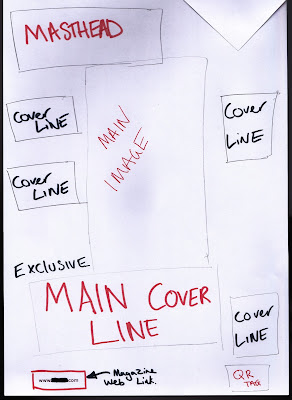
I created a final sketch of how I am going to outline and position my cover page by sketching out where I am going to place the main image, cover lines, masthead etc.
This helped me a lot as I could get straight to the point as all had to do was just place all the information and pictures on where it is positioned on the sketch.

Here I have added all the cover lines. That I have taken from my previous mock ups as I didn't have to create new ones. I also decided to try make the masthead white, but seeing as my background is white I can not use a white masthead as it looks to plain and blends in with the background where as I want it to stand out so the reader can easily visualise the name of the magazine.
I also tried to take off the red rectangle boxes from behind the main cover line (as seen in the first above picture) to see if it made any differences or if it looked better, but with given feedback I found out that it looked way more eye catching with the red rectangle boxes behind the text as it stood out in front of the main image on the page.
On the main image I tried to add a little shadow effect on the back to outline the main image, this is not very noticeable so I may change this to a more brighter colour such as red so it stays in contrast with the page and colour scheme.
I have also added many effects on the cover lines such as drop shadow, bevels, strokes, inner glow and many more to make it look more bold, strong and eye catching for the reader.
Here is the next version I created of the final cover, but as you can see I have tried to get an image that I have myself taken and try place it in the background to see if it made my cover look better. When I got feedback from friends and teachers they told me that the background did not go to well with the picture and didn't really relate to the magazine, I myself could also see that so I decided to get rid of this in the next edit I am going to create of the cover.
As you can see I have put back the red rectangles behind the main cover line. I have also put the main cover line at a twisted angle rather than having it straight and simple.
I have also put a QR tag in the bottom right corner as the same as one of my previous mock ups as it looked very good there.
Also the cover lines did not relate to the background because of the different colours used. The blue used on the cover lines could not really be seen as the background image also has blue in it (sky), so this was another problem that the background has caused.
The masthead i decided not to change i kept it the same as the previous edit above, but I have just duplicated the layer making it red and placing in front so that the white can be seen as a shadow at the back. This created a more eye catching look for the reader as it stands out even more on the rectangle box behind.
Final Cover Piece
 |
| Main Cover |
I have taken off the background, the plain white background makes the page look more eye catching as the cover lines, masthead and main image pops out and gets the readers attention towards the page and the main things on the page.
I have changed the shadow of the main image to red, as you can see this is way more noticeable than the grey background which makes it noticeable for the reader, this is also in contrast to the page as most of the things are red such as the masthead and cover lines. I have made the cover lines go around the picture and not in front so that it does not interfere with the main cover line that's going over the image as the main cover line is linked to the main image.


No comments:
Post a Comment